CSS Re-work, making the site simpler, cleaner and lighter
Published the 2018-10-18
I made this entire website by myself, and, since CSS isn't my forte, I lost a
lot of time monkey-patching.
The document grew a lot, and I'm convinced that there's a lot of mess, duplicate
and badly designed parts.
The clear examples of that were around spacing in the title, and video iframes
(e.g. in the [google AMP article](https://artemix.org/blog/google-amp.html)).
The biggest problem I encountered when designing the website was that I had no
real knowledge about UX, typography or proper web design.
In that sense, I was just "placing" elements, and when I managed to place them
right, it was "ok, done" for me.
Line spacing was fucked up, as for overflow, or font rendering, but it "worked".
Now that I'm working on redesigning my blog, I'm taking those lessons into
account, and I'll try to make it much simpler, and adaptive.
## Analysing the existing structure
The overall blog layout is simple enough for me to not directly care about it.
Instead, I'll put my attention around the article, which is, after all, my main
content!
I firstly analyzed all the "top-level" node types, for each article, which
allowed me to build the following list.
```json
[
"p",
"h1",
"h2",
"h3",
"ol",
"ul",
"blockquote",
"pre",
"iframe"
]
```

> Example result with Google AMP. I decided to exclude the script tag, since it
> doesn't render anything.
>
> The script tag is part of the vimeo player's iframe loading.
I then separated every content type into type categories: typography, blocks and
lists.
```json
{
"typography": [
"p",
"h1",
"h2",
"h3",
"h4",
"h5",
"h6"
],
"lists": [
"ol",
"ul"
],
"blocks": [
"blockquote",
"pre",
"iframe",
]
}
```
Typography is the general-purpose text, lists is separated, because their
spacing, alignment and such, requires extra caution;
and finally, blocks are a completely different entity, as they'll have special
rendering used.
With the current markdown renderer, the images were scoped inside a `p` block,
which means that it was inline-level tag placing.
I needed to wrap the images inside figures instead, but that'll come later on.
In that sense, I decided to not care about images right away.
## First document schemas
Since we're re-designing everything from the ground up (while obviously trying
to keep the design close to the "old" one), I worked with my favourite tool
to build the schemas: My whiteboard.
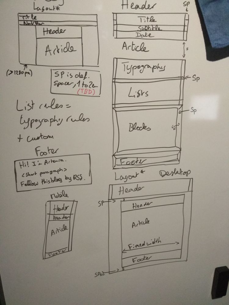
I decided to drop the two-columns footer, which was filled with too much
information, to keep it simple and light to read.

After integrating the synaxic-coloration CSS rules, the website starts to look
like something!
## Rules fixing
I decided to change some rules to add custom behaviour.
The first one is obviously images, wrapping them in `` tags,
and using the alt text as figure caption.
This was a bit tricky, since I just discovered how to tweak the markdown library
I used (which is [Marked](https://marked.js.org/)),
but the following code snippets managed to do what I wanted to do.
The hardest bit was the fact that `img` is an inline tag, which means that I
also had to overwrite the paragraph renderer.
```js
const renderer = new marked.Renderer();
renderer.image = (href, _, alt) =>
`${alt}`;
renderer.paragraph = text =>
(text.startsWith(''))
? `${text}\n`
: `
${text}
\n`;
```
The second feature I wanted to add was an auto-prefix for heading tags, to allow
easy anchor-link picking (using the well known `#`).
```js
renderer.heading = (text, level) => {
const escapedText = slugify(text);
return `# ${text}\n`;
};
```
## Video
Vimeo offers a quality service, but one thing's bothering me: I *need* to use
their player.
Thing is, it's an iframe, requiring javascript and pinging a few domains. *Way*
too heavy for me.
Thankfully, after some little research, [Cloudinary](https://cloudinary.com/) is
the best service to get a direct video feed, which I can then directly put
inside a HTML5 video tag!
With that came two bonuses:
- The ability to resize a video "on-the-fly", allowing me to cap the video image
size.
After some trial and error, I found that 1600 for width is the best
compromise between quality and size.
- The ability to convert a video in my two target formats (mp4 and webm),
"on-the-fly" again.
For now, I'm uploading video medias through their management dashboard, but
that'll change in time, once I'll have enough video content to upload
to start bother.
But since Marked was a real bother to extend, and since my video tags are pretty
simple (the tag follows the format `{ video }`),
I decided to go with a regex parse/replace, to put some HTML5 video tags just
before passing the document through the marked renderer.
```js
const cloudinaryURL = 'https://res.cloudinary.com/nyx/video/upload/w_1600/blog/';
content.rendered = content.content
.replace(/^{ ?video ([\w-]+) ?}$/gm, ``);
content.rendered = marked(content.rendered);
```
This rather... "ugly" method picks the name I've put inside the tag, and uses it
to build the cloudinary URL.
## Future plans
I'd like some form of comment space, but that's still in discovery process,
so that'll take a while.
This redesign is quite refreshing, and allowed me to really simplify my blog's
code, rendering it even lighter and more compatible.
> In-the-future edit: The comment space experiment was a failure, I really don't
> think it is a model that fits well in this blog.